Case study / Interactive experience
The Warehouse photo booth.
A playful character world became a guest-made portrait and a branded print to take home.
Role: Experience designer and developer · Skills: character direction · interaction design · camera and portrait systems · print integration
Situation
Make the launch feel playful and personal.
The Warehouse brought creative and technical communities together around coworking. I wanted the launch activation to share that inviting tone: guests would take part, recognize themselves in the result, and leave with something physical.
Task
Carry one identity across the room.
My task was to turn a camera moment into a guest-specific black-ink portrait that could be reviewed and printed. The character system needed to keep each person recognizable while fitting the Warehouse identity. The separate website case study shows the wider brand kit and posters.
Action / Experience architecture
A photo becomes a character, then a keepsake.
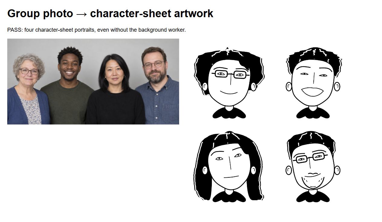
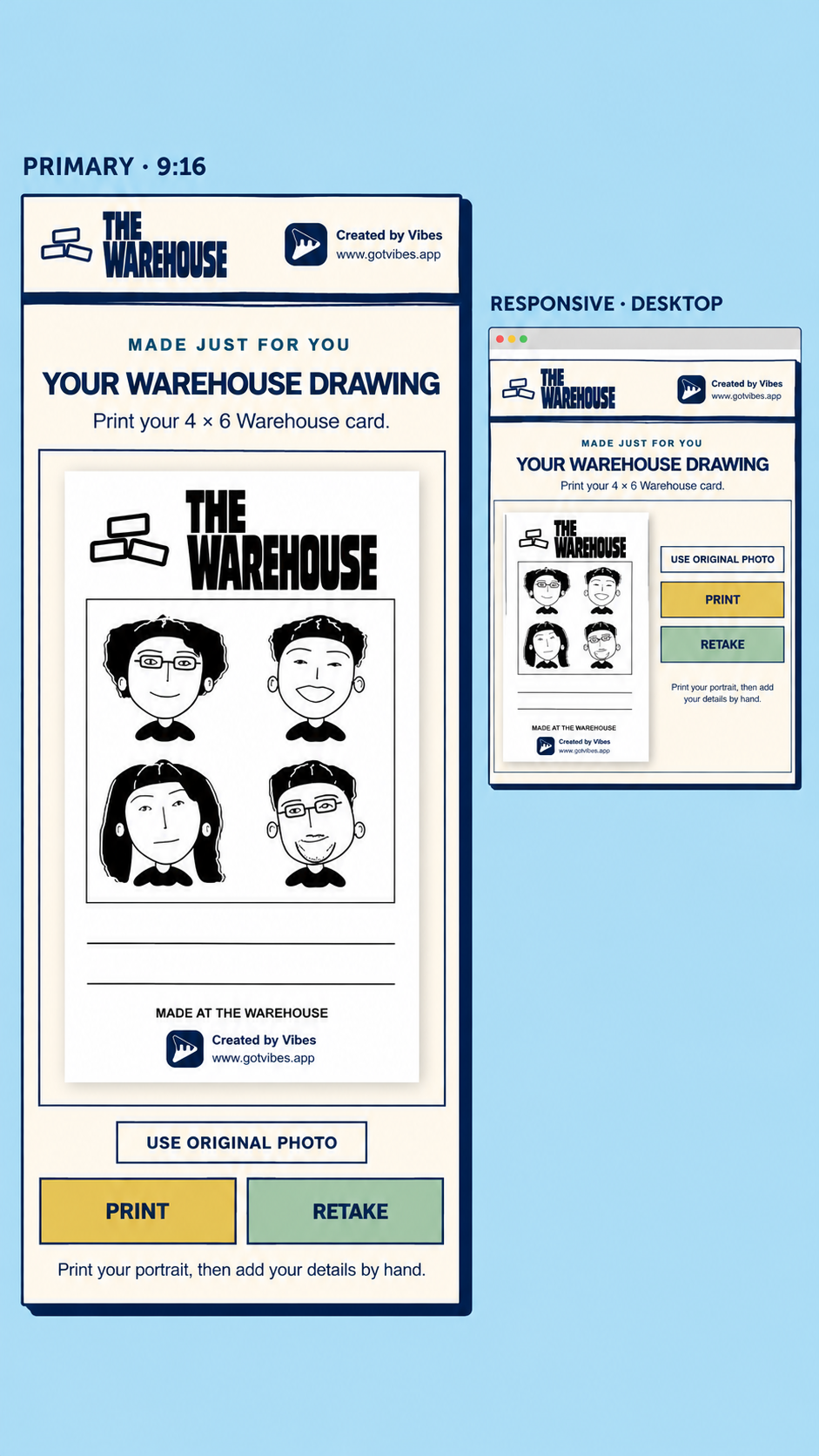
The booth analyzes the captured image locally. MediaPipe finds facial landmarks and separates hair; additional checks look for visible accessories. Those details guide a vector character drawing based on my selected sheet. The resulting card can be reviewed, retaken, printed, or shared by QR.
Portrait workflow / on the booth laptop
- 01
Capture
The camera freezes the guest’s chosen frame.
- 02
Analyze
Local MediaPipe models identify face landmarks and a hair mask; other checks assess visible details.
- 03
Draw
The local renderer maps those features onto the character sheet’s vector style.
- 04
Deliver
The guest reviews the branded card, then prints it or opens a temporary QR download.
Action / Character direction
A character sheet with room for each guest.
For the portraits, I narrowed the reference direction to what would work on a small printed card. Sparse pen lines had to keep a face recognizable; changes in the eyes, brows, and mouth had to make expressions distinct. I tested the balance between a large face, tiny shoulders, and enough white space for the drawing to stay clear in print.
01 / SimplifyKeep the face, hair silhouette, and a few identifying details.
02 / ExpressLet subtle eye, brow, and mouth changes carry the emotion.
03 / PrintUse black ink, open white space, and legible branding.
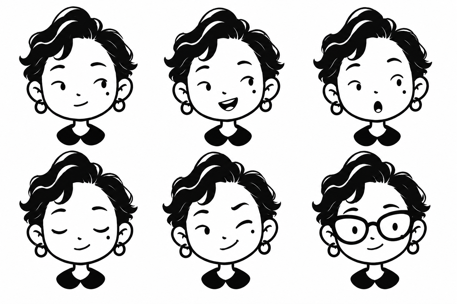
The sheet defined a style, not a fixed face to apply to everyone. In the booth, each guest’s photograph supplied their own hair, face shape, expression, and visible accessories.
Action / Development
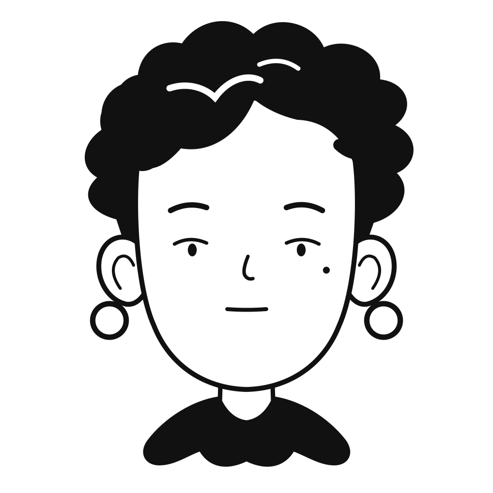
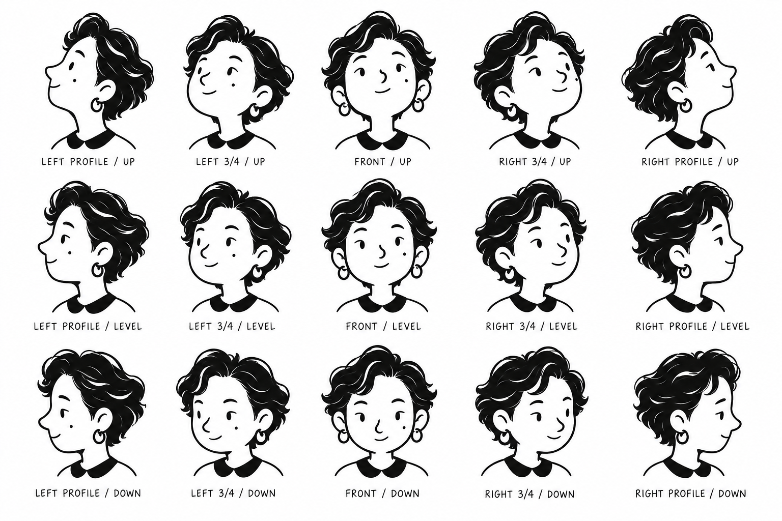
From a sheet to a working portrait system.
I translated the selected look into an editable vector character, separating the hair, face, accessories, and expression layers for the booth. A later angle study explored how the same character could read in profile and three-quarter views.
Action / Build
From camera to card.
I designed and built the stand-and-TV setup, connected camera capture to the local portrait renderer, and integrated printing. The drawing stayed black on white; the Warehouse mark and website framed the guest’s card.
Action / In the room
The booth in motion.
This launch recap shows the experience beyond the interface: guests taking part, a printed card in hand, and the screen, laptop, and printer working together in the space.
Result
Distinct portraits from selected captures.
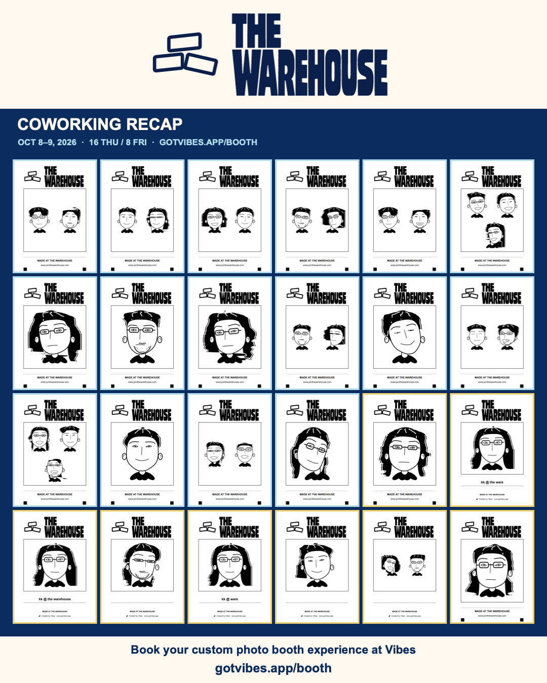
The launch recap brings selected results together: different captured faces became different illustrated characters, each composed on a Warehouse card. The character style stayed consistent while the portraits kept individual hair, expression, and visible details.
Similar brief?
Build a moment guests can make their own.
I design the visual language and the working technology for interactive experiences at launches, events, and public spaces.
Inquire about a project